No products in the cart.

Nanortalik 3°

Qaqortoq 3°

Narsaq 7°

Paamiut 3°

Nuuk 3°

Maniitsoq 4°

Sisimiut 4°

Aasiaat -1°

Kangaatsiaq 4°

Qasigiannguit 4°

Ilulissat 4°

Qeqertarsuaq 0°

Uummannaq 2°

Upernavik 3°

Qaanaaq 2°

Tasiilaq 6°

Ittoqqortoormiit 6°
FROM FEATHER TO FACE
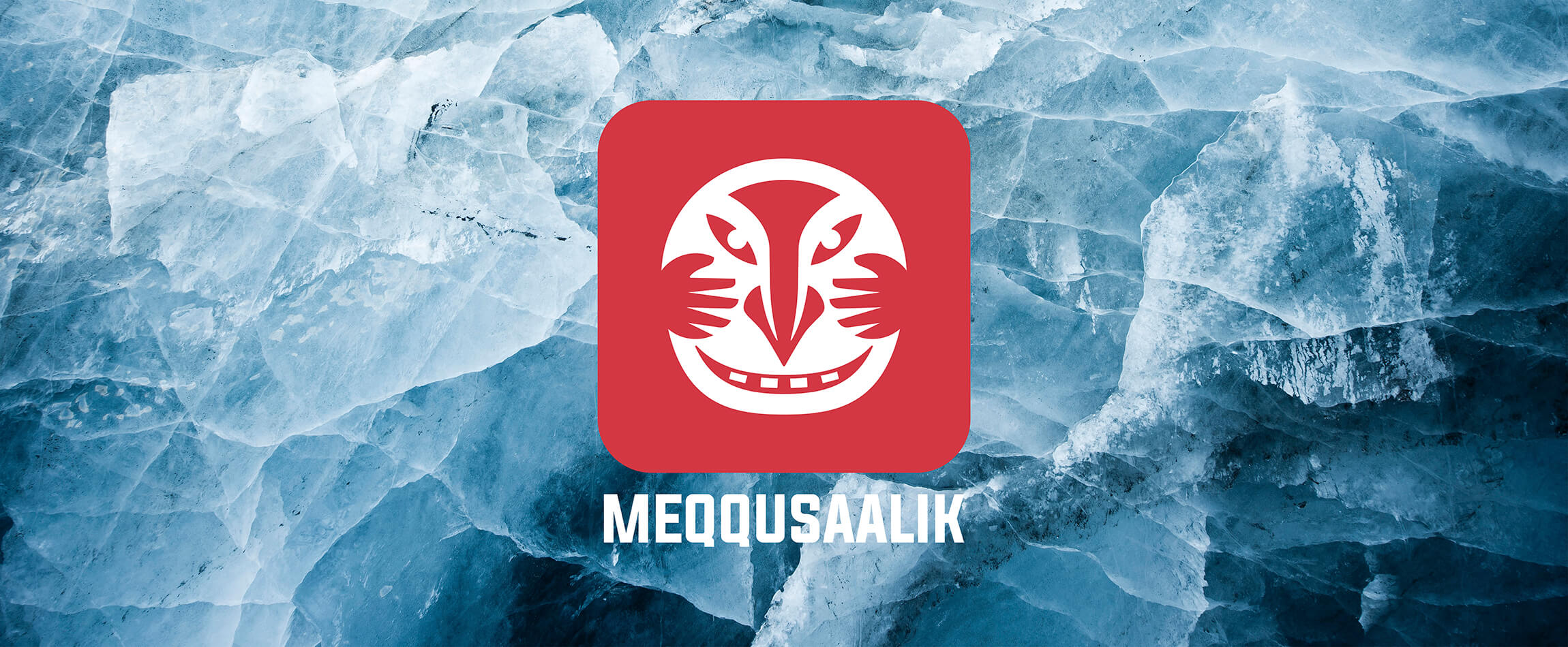
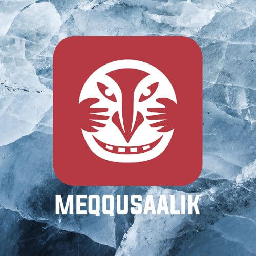
Meqqusaalik’s former logo was an intriguing, elegant feather. But it didn’t tell the full story of the inspiration behind the name. The new logo signifies our respect for our ancestors, the forces of nature and spiritual protection.
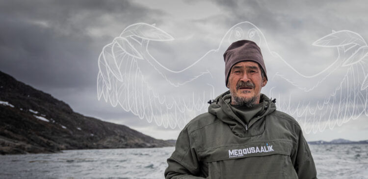
The inspiration behind the name is the ancient story of Meqqusaalik, the spirit guide who could protect humankind with his magical plumage. A compelling tale of positive interaction between people and the spirit world.
However, in the stories passed down from our ancestors we have only limited descriptions of what the spirit guide looked like. This made finding a facial image of Meqqusaalik quite a challenge. We drew inspiration from artefacts such as old Inuit masks, Greenlandic tupilaq shamanic figurines, and illustrations. The end result is a logo representing the face of Meqqusaalik as he might have looked: half bird, half human. Smiling and kindly. With feathery, protective hands. A logo that moves the brand a step closer to the Greenlandic soul, and our tradition of wearing amulets as protection against the harsh Arctic climate.
The new Meqqusaalik logo is therefore more than just a new design. It also serves as a contemporary amulet sewn into every garment.
The new logo was created in a partnership between KNI Marketing and Marketsquare, in Copenhagen. In autumn 2023, Meqqusaalik received a Cresta Award for best design. The prestigious international Cresta Award celebrates the best work in advertising and design.
